Contrary to popular belief, global warming is not simply a bad thing: there are winners and losers. While low-lying countries, like Bangladesh, are expected to suffer extensively from rising temperatures and sea-levels, countries situated at the top of the Northern Hemisphere, like Canada and Russia, might gain enormous regions of pristine exploitable farming ground, as temperatures rise.
Contrary to popular belief, global warming is not a natural disaster: it is a political disaster. The countries that cause the global warming effect, aren't necessary the countries who suffer the consequences. National political agenda's hardly align with their globally felt consequences.
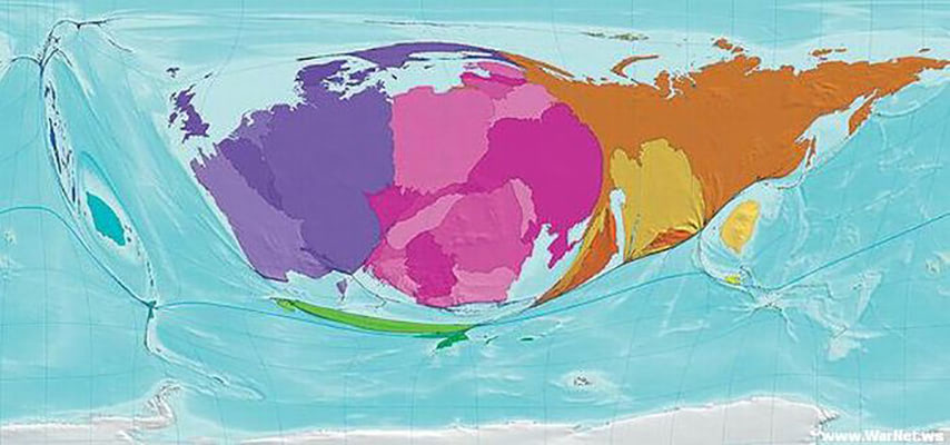
Imagine the effects of global warming were fair. The visualization above shows a distorted world map, in which the landmass of countries is scaled according the amount with which they've reduced carbon emissions between 1980-2000. Life would be so simple, if polluting countries would simply disappear into the ocean.
Some notable elements visible in the map:
1. The US, Canada, India and China are virtually invisible on the map: They aren't doing much.
2. For Canada it might be a cynical self-centered strategic decision to warm op the globe and gain some fresh farming soil – wouldn't have expected that from those friendly Canadians!
3. Almost half of the cuts are made in the territories of the former Soviet Union. Surprisingly so, because these currently colder region would actually benefit from a warmer climate! Is this because of the decline of the Soviet Union? But why then did Russia gratify the Kyoto protocol? Short term politics? Is Russia the philanthropist of the world?
4. Europe is doing OK with Germany and Poland is taking the lead. Spain and Portugal are below sea-level.
5. The Middle East region is doing OK.
6. Africa is relatively small: It's hard to cut your carbon emissions if you weren't emitting much in the first place – Indeed, this isn't fair at all.
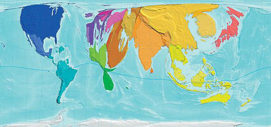
Below, another distorted map, this time with the increases in emissions translated into land mass.
The maps were created by Daniel Dorling, Mark Newman and Anna Barford and published in the book The Atlas of the Real World: Mapping the Way We Live (Amazon).
Chris
The U.K. is small on this map because it was never a very notorious producer of greenhouse gases in the first place. Old World Countries, with a handful of exceptions, were already well established as urban centers at the time when America started construction on the interstate system. Countries which became urbanized later on, like China, largely took the American system of city construction, which included commuter suburbs, and the development of a culture centered around automobiles and the burning of fossil fuels. It's not as hard for a country that doesn't produce as many greenhouse gases in the first place to lower its output as it is for a country who's central economic pillars produce them in large quantities.
Posted on
Loz
I'm surprised the UK comes off quite well in both those maps. I was under the impression we'd talked a lot about climate change but not actually done much.
Posted on